One of the BT Help squad goals is to identify and resolve customer issues before they become problems. We regularly review analytics to see where users are struggling to complete the task. During the big sport events we always see increase in the support calls. That means, information on the site is out of date or just hard to find.
Last year, when w realised that Europa League and Champions League final falls on the same weekend, we decided to create a pro-active help strategy. That meant, updating and simplifying BT Sport FAQs and creating banners to be displayed across three pages: help homepage, contact us and BT Sports help hub.
While the content designers worked on the FAQs, I did a research on the Europa and Champions League brand guidelines. After couple rounds of design, we created two shiny banners, with a spot-on branding and BT Sport logo. We high-fived each other, job well done, right?


Wrong! Before publishing the banners, we did briefly discuss banner blindness. We believed that location of the banners on the help pages and visual recall will be enough to overcome it.
Banner blindness is then user on purpose or unconsciously ignores a banner displayed on the page, because they perceived it as being an ad.
After the weekend, analytics report came and that squad was shocked. Banner conversation rate was only 1.2%. Despite that, due to great work on the FAQs, contact rate remained low over the weekend. That meant that users were able to find the answers without having to call support. But as Product Designers, we knew we have to do better.
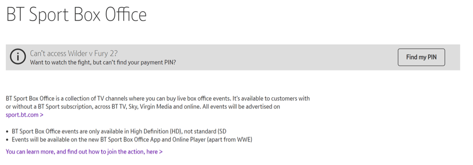
Last month, when we started preparing for a Wilder vs Fury boxing match, we revisited help banner idea. From analytics we knew that customers continually have difficulties with their Payment PIN during those type of events.
Previous banner failure loomed over us, but this time we decided to take a daringly simple approach and design them in the service notification style. We waited for the analytics report with anticipation.

This time engagement rate was 12.4%, together with shortened PIN reset journey from 7 to 3 steps, we not only helped the users to see the boxing match on time, but also reduced revenue in lost sales.
To sum up, temptation to over-design is always there, but usually a simplest solution is the best one. I think, context is important here, too. Perhaps, once users are on the help site, they expect to see service notification banners, rather than elaborate visuals. It was also a goods reminder, that we are not our customers.
