Designers and developers have a power and responsibility to make their products inclusive.
There is a misconception that making website accessible is very long and expensive process, but that’s not true. I will break down the design process and suggest ways it can be made inclusive.
Designers and developers should aim to pass AA accessibility level, as minimum.

DESIGN
COLOUR CONTRAST
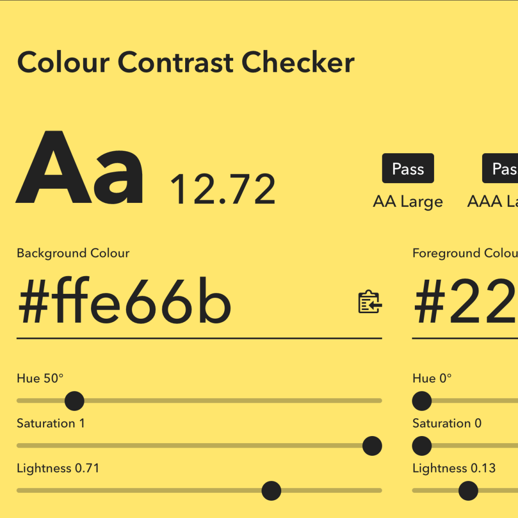
When designing, especially the call to actions, consider the colour contrast. Colour contrast is combination of colours. Users with visual impairment can find it difficult to read the text if background is too light. If background is a gradient- test both colours.
https://colourcontrast.cc/
https://webaim.org/resources/contrastchecker/
COLOUR BLINDNESS
Don’t relay on colour alone to highlight important an information. Highlighted information will look same as other colours to colour blind user. Good practice is to use an icon as well.
https://www.toptal.com/designers/colorfilter/
CONTENT
HEADINGS
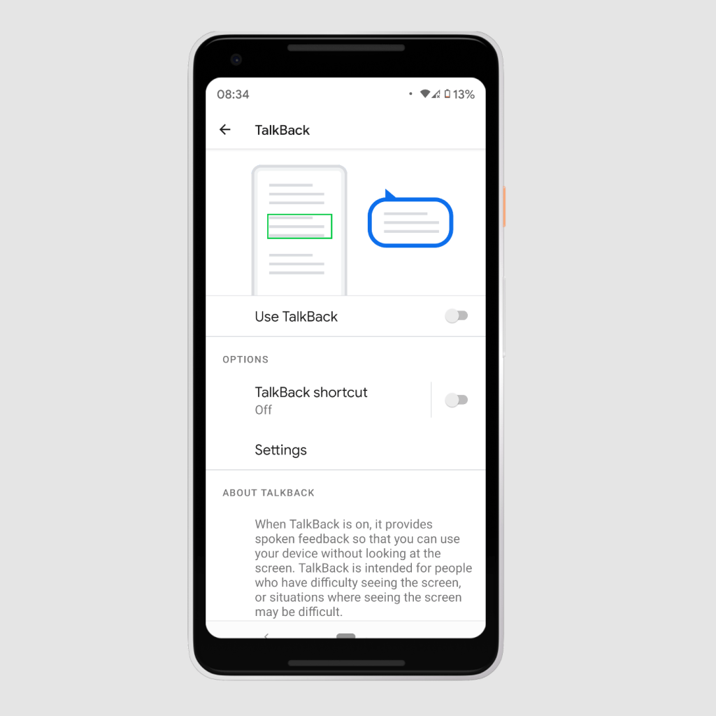
Visually impaired users will use a screen reader to access the website. Then designed the website define the H1 and H2. Website headers should follow a logical structure or it will be read on a screen readers in a wrong order and confuse the user. Website should have only one H1.
To test screen readers designers can use their phones to enable TextBack on Android or VoiceOver for iOS.
Further reading
https://abilitynet.org.uk/factsheets/introduction-screen-readers
IMAGES
Add ALT text to the images, that describe what user can see in the image. If image is decorative, sometimes is better to leave the ALT text clear, as everything whats written will be picked up by a screen reader.