My Role
- Design research
- Journey mapping
- Prototype
Problem
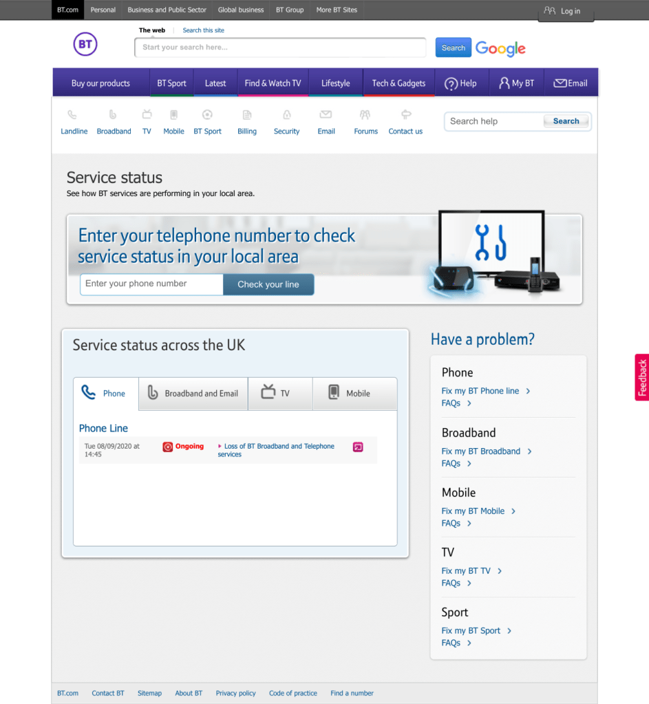
First step to fix a wifi is a Service Status page. As there is no point trying to fix the broadband if there is an outage in the area. BT’s Service Status page was a forgotten corner of the website, despite the high traffic. It wasn’t mobile friendly and some information on it was incorrect.
Bringing the Service Status page to XXI century was a big technical challange, I had to work closely with a development team to make it possible.
Research
We decided to ask a very active BT Community to give us feedback on the Service Status page. Research was unmonitored and main findings where:
- People had difficulty with remembering their phone line number.
- People mentioned they would expect the option of adding their postcode.
- People expected to see “traffic lights” colour coded – green, amber red as a visualisation of their BT service status.
- People expected information about their service in their area.
- People mentioned they would visit BT service status page if they were experiencing internet issues.
- People expected to be logged in to be able to see information about their service status.
- People mentioned they would expect to see information of maintenance in the BT service status page.
You can see the BT Community post here
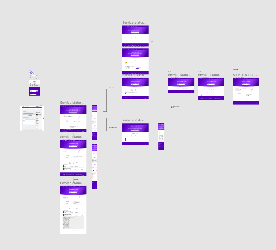
User Journey
First, after looking at findings I suggested service that users could use their postcode or mobile number to check the status instead of landline number. However, that was technically impossible.
Second, I had to cover all the basis with this journey as incorrect landline number or the platform being down. That’s why I suggested after two unsuccessful searches user is offered self-service or reporting opinion.
Design
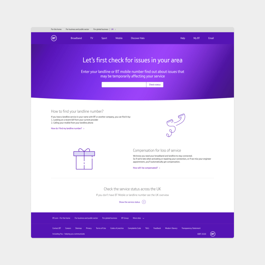
Step 1
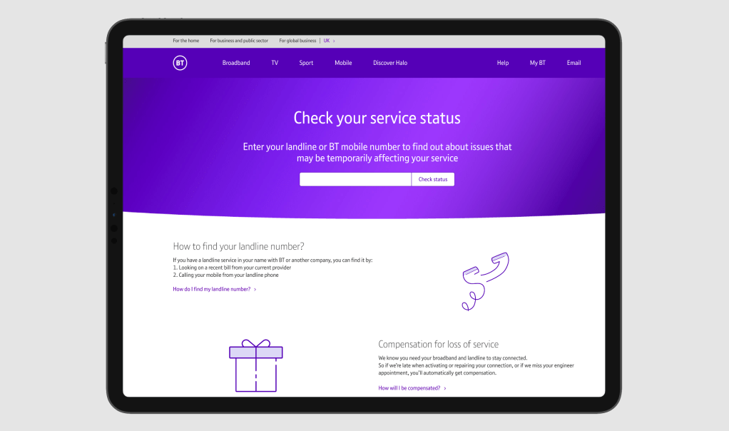
I wanted to change look and feel of the page and place a focus on most important thing on the page- search bar. It’s also main action we want users to take.
Additional information is there to support users who don’t know where to find a landline number or want to learn about the compensation- it’s one of selling points.
In early designs, I also included the Service View across UK. However, in research we found that users didn’t care about the Status Across UK and wanted to see personalised information.
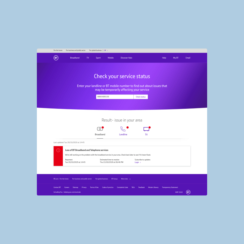
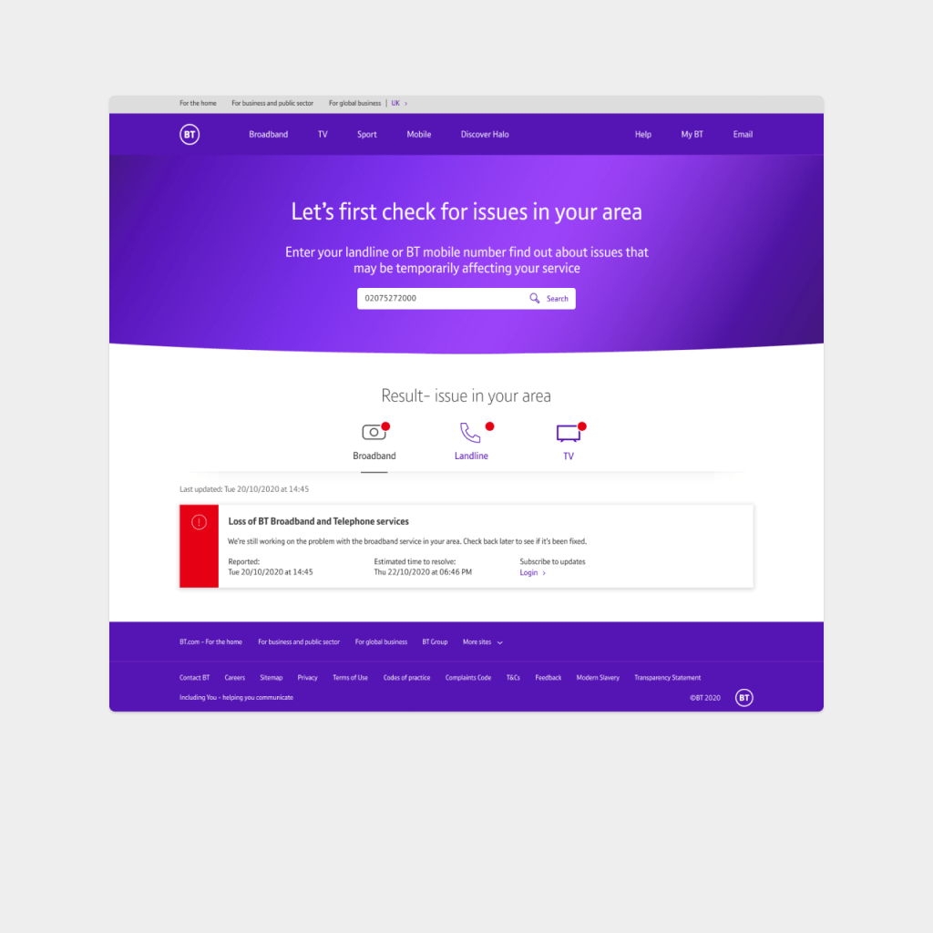
STEP 2 – Issue in the area
If the issue is found in the area, the card is displayed with a brief explanation and estimated time to fix.
User can also view status for the Landline and TV services, there is a red indicator to show a problem.
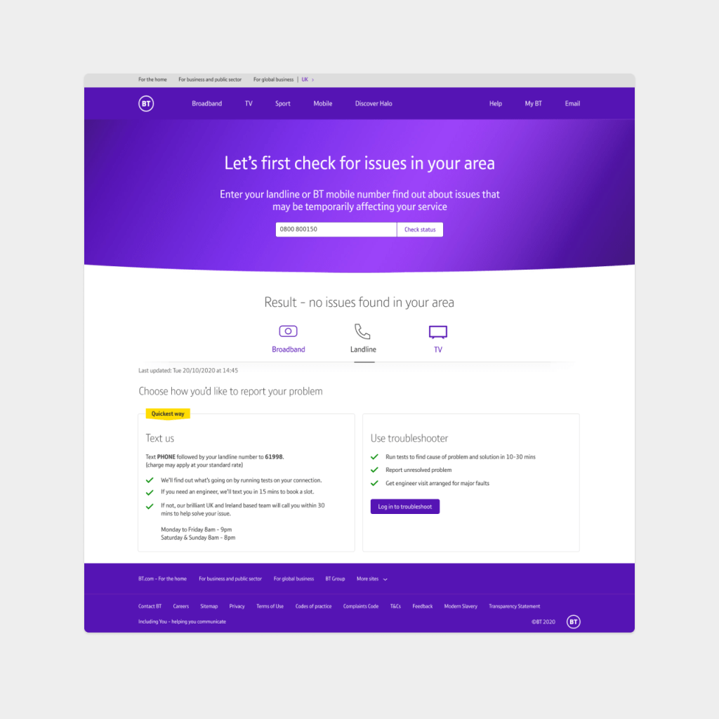
Step 2 – NO issue
If there is no issue in the area, next best action for user is to use Troubleshooter or Text to Call. Working with stakeholders we decided on next best steps.
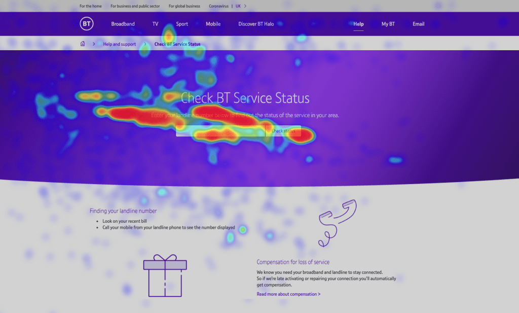
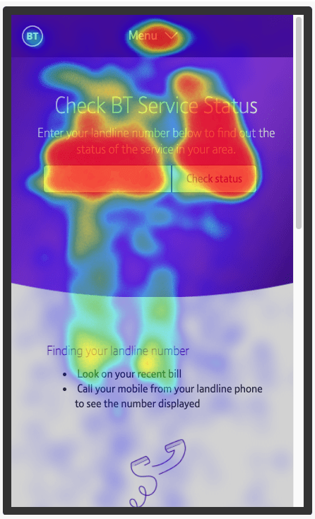
Heatmaps
Since the page launch, I have been monotoning the users and looking to heatmaps, to understand if the information can be streamlined. I also looking to understand if users are noticing and interacting with a tabs.
The page before wasn’t mobile friendly and it’s important to gather all the data for the next iteration.