
MY ROLE
- Design research
- Journey mapping
- Workshop
- UI/UX design
- Prototypes
- Usability testing
THE PROBLEM
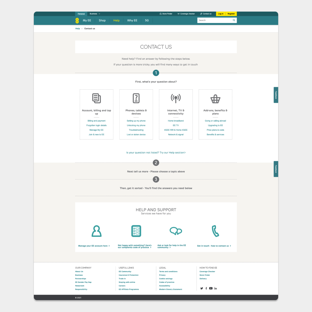
Exploring possible website optimisations, the Contact EE page stood out. It was performing badly, because of a two page journey. First page was focusing on showing users relevant FAQs and second page had contact options hidden behind the tabs.
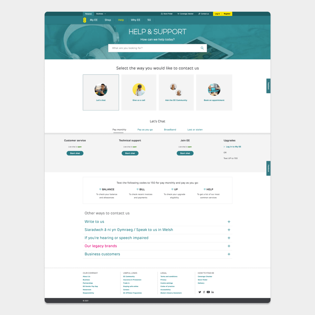
Another challange was displaying all the contact options- from chat to text. Users needed freedom to contact EE in a way that suits them.
How might we remove friction customers currently experience in trying to find details to contact EE.
View demo above or visit the page https://ee.co.uk/contact-ee
Research
Data can’t tell user intent
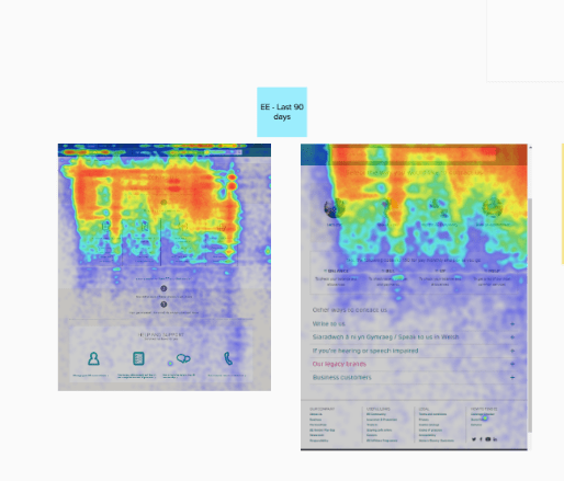
I gathered and analysed data from the Adobe Analytics and read the support chat transcripts, focusing on the rating the user gave to the chat experience (I can see only the feedback comments, no personal information is included in transcripts).
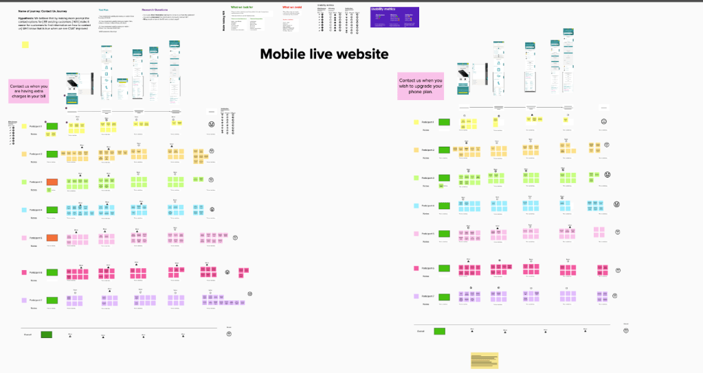
After talking to the user researchers, we decided to cross reference the findings and ran two usability sessions with EE customers.
I also mapped all possible contact options for the EE customer and worked with stakeholders to finalise them.
Community research
We also included very active EE community and gathered unmonitored information from them. You can see the post here:
RESEARCH FINDINGS
Usability sessions confirmed what analytics were showing:
- Users struggled to find the contact numbers
- Users got lost in the FAQs
- Users got stuck in the loop and gave up, waiting for a chat bubble to pop up.
Design & Accessibility
Accessibility was important to me, from the start. In UK, hearing or speech impaired customers can use Relay UK services. This information was hidden way in the accordion at the bottom of the page.
After creating a first prototype, I had design review with the accessibility team and Ofcom. In the first version of the prototype, I surfaced contact options for hearing or speech impaired, but by doing so, I created an unnecessary step. In next iteration, I added the options together with a phone numbers.
Prototype & Testing
I started redesigning the page with a mobile first approach. After all, analytics showed that over 70% were accessing the page are using a handset.
I wanted to create a simple, lean MVP. It was important to create a design that can be adaptable and elements could be moved up or down easily, depending on the data.
The prototype was tested in the lab, with real EE customers- they found it easy to use.
We launched it as an a/b test, it’s reliable way to see how the page will perform outside the lab, with a real life customers.
Results
Average time spent on site: Old page – 7 mins 30; New page – 30 seconds.
Bounce Rate: Old Page – 24%; New page – 7.85%
