My role
- User flows & wireframing
- UI/UX design
- Web design
- Prototyping
THE PROBLEM
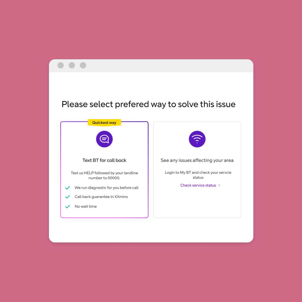
In the September (2019) I was given an interesting problem to solve. BT was introducing additional way to contact customer support. They were working on Text for a Call back feature. It was partly driven by the high volumes of calls to the support centres, due to more customers working from home. Broadband was as important as electricity or water.
To create the solution, I based my designs on the Nudge theory.
The nudge theory’s inherent belief is that the majority of decisions people make are made instinctively and unconsciously rather than made with rational decision making.
(https://behave.co.uk/)
FAIL FAST APPROACH
It was new proposition for us and our customers. From previous research, I knew customers won’t trust it straightaway. Many of us experienced waiting for a callback and never receiving it.
First, I asked for a promise of a guaranteed call back, I didn’t want to create something misleading. After I got it, we thought how to position it from the copy perspective.
Second, I wanted to create a simple design, that was impactful, yet didn’t take too much of development time, in case it wouldn’t work.
We decided to launch an a/b test and fail fast with this project
Yellow indicator
I did a competitor analysis and designed couple of options, how the new feature could be differentiated out from other contact options. In the brand guidelines, we already had this yellow label style, however it was used for the online shop.
I wanted this label to appear only once on the page and worked with a content writer to come up with a snappy sentence- “Quickest way”. Basing it on the nudge theory, I also theorised that the yellow indicator will influence the users behaviour.
RESEARCH
We built and launched an a/b test, that ran for couple of months. There was an immediate high uptake of the Text to call option.
While it is a fastest way to contact BT and fix your broadband, I think, labeling “Quickest way” has something to do with it.
Result
Data showed an immediate uptake of the new feature. In the A/B test users were split 50:50 and 60% of the users chose B option- text to call, rather than troubleshooter.
This feature became very successful, with a high customer uptake. Now, it’s also going to be launched also in a sister brand -EE.
In the research, I observed that customers 100% trust the indicator and always mention it as being very useful. That’s why, as I scale up this feature, it’s important to me not to break the customer’s trust and truly highlight a quickest way to solution.
